Showing posts with label DESIGN. Show all posts

Friday, 15 October 2010

Quality of Life Improvement 29: Anatomy of a Tulip (2010)


The closest that we've ever come to affection for corporate America came in the early-1990s, courtesy of (yes, shockingly, we know) United Airlines.

Hong Kong's airport was still the storied Kai Tak (啟德機場) in those long-gone days. The airport's single runway had been carefully inserted on a tiny sliver of land between Hong Kong's mountains and harbor. Owing to the surrounding topography, pilots landing at Kai Tak would descend over Hong Kong, Victoria Harbour and Western Kowloon, passing over the beacon on Lion Rock while executing a tricky, tight 47° final turn, at low altitude, to (hopefully) line up with the airport's runway.


photo © Phil Wells

For any lucky enough to remember, the sight was spectacular—particularly on days with low cloud clogging the mountains. On those days, the scream of engines would be heard, but nothing would be seen. Then, almost instantaneously a 747 would emerge from the murk in a steep bank.

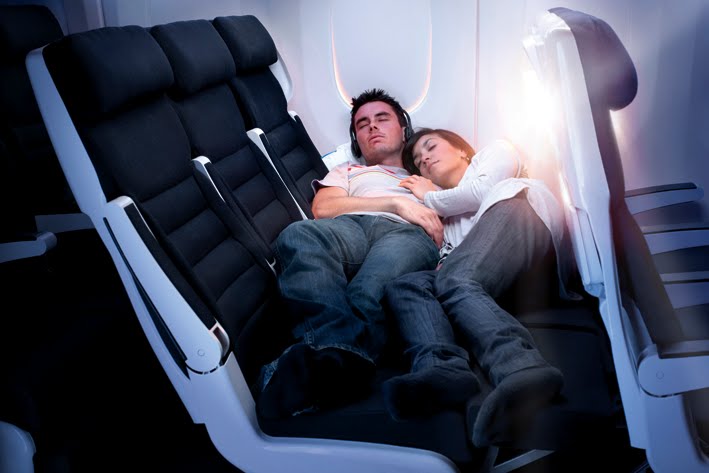
We remember a searing, sappingly hot and humid day in the summer of 1994. While absorbed in some forgotten banality, we heard the familiar sound of approaching engines, and looked around for the horizon, but saw nothing but block after grimy block of flats. Resigned to seeing nothing but laundry fluttering from open windows, we looked upwards again when the sound of the approaching aircraft became even louder and more piercing.


Then there, through the whites hanging on lines, was a United Airlines 747. For a short second after seeing that flash of red, white and blue, something felt familiar. It was as though we had seen a handsome, familiar face among the rows of hanging ducks that lined the streets of Hong Kong. Maybe we heard the last few bars of Rhapsody in Blue and thought of the shiny, muscular United States. Maybe we saw the image that we've seen dozens of times before over the past quarter-century: Diamond Head framed by United Airlines Tulip-emplazoned tails at Honolulu Airport. It reminded us of what's probably the love of our life—Hawaiʻi—and it made us smile.


Many things about that experience we vividly remember, but more than any, we remember the brilliant white tail emblazoned with the familiar United "Tulip," the sylized capital "U" logo created by American design legend Saul Bass for the airline in 1974.


Saul Bass is an American hero, a jack-of-all-design-trades. Beyond United Airlines, he designed now-iconic logos for AT&T, the Girl Scouts, Kleenex, Quaker, United Way, Warner Music Group and, ironically, Continental Airlines' "meatball" logo (1968-1991).


Bass is also known for his contribution to the cinematic arts. In particular, he created famous opening title credit sequences for famous films "The Man with the Golden Arm (1955)," "Vertigo (1958)," "Anatomy of a Murder (1958, with Duke Ellington, no less)," "North by Northwest (1959)" and "West Side Story (1961)," among many others.


Now, decades later and after many crises, United has recently merged with Continental Airlines. To be fair, over the last decade the airline industry has seen rocky, sometimes downright grim days, but the United "leadership" have never lost an opportunity to demonstrate their incompetence and venality.

Don't want to figure out how to pay for your employees' pensions, after you and your predecessors have frittered away their retirement money with foolish, risky investments instead of traditional, conservative investment in the bond market? No problem when you're a member of United's corporate leadership; The answers are simple if you're a CEO at United: fuck 'em with a closet-stick!

Forget the pensions. Forget the pensioners. Blame the unions (since, clearly, they're the ones ruining the United States), but keep your own incomes at vulgar levels. To give just one example, in 2006, United CEO Glenn Tilton's compensation was nearly $40 million. That's right. Forty. At the same time, United employees received generous lessons in the "cyclical nature" of "free markets," and other fantasies.

So by comparison, something like the deletion of a much-loved logo is actually quite minor.

Trivial, really.

That being said, the leadership of the new corporation created when United and Continental merged have decided to keep the United brand—a smart move—but have elected to delete United's iconic tulip in favor of Continental's...mirrorball...or globe...er, something...(?).

Almost immediately after the announcement, an outcrying of lament began among those who consider the Tulip part of the US' patrimony, along with the flag and Dolly Parton. Facebook pages sprang up; Online petitions began to circulate; Blogs, like this one, commented angrily about the asinine decision, but it all seems to have fallen on deaf ears at United.

From a commercial perspective, it beggars belief that Continental's bland, unidentifiable logo would be chosen as the emblem of one of the United States' most visible brands. Why quit a logo with longstanding, widespread popular recognition for one that almost no one can conjure from memory on command? It doesn't seem sensible, even by the already low standards of sensibility that we hold out for United's corporate directors.

Our hope is that United is trying to educe an empassioned response from the public, calling—even demanding—for a return of their beloved Tulip, something along the lines of the conspiracy theories surrounding Coca-Cola's experiment with "New Coke" in the 1980s. We hope that United is subtly pulling the publicity strings, and that after "overwhelming popular demand" the Tulip will be triumphantly returned to the tail of United aircraft where it belongs, and in so doing, that it will have created a feeling of renewed likability and familiarity with the United brand after years of acrimony between the airline and the flying public.
That's our hope. The only trouble is that we're not sure that the people at (we kid you not) Wacker Drive are that clever.

Friday, 18 June 2010

Quality of Life Improvement 27: The Goodnight Kiwi


Hawaiʻi desperately needs an instantly recognizable animal mascot. Humu­humu­nuku­nuku­āpuaʻa perhaps? Nēnē, or will Canada accuse us of filching their national bird? How about the Wallabies of Kalihi?

Aotearoa New Zealand has no problem with their national animal identity. At the mere mention of "kiwi" quite specific notions are top-of-mind: pathetically cute, flightless bird; outdoorsy pseudo-Englishmen; a country that not only always sits at the grown-up table but should be presiding over it permanently; and a hairy, testicle-like fruit that's green on the inside, full of vitamin-c, that nobody much likes.

Aotearoa has put this kiwi to work just about everywhere, so we hope that it has good union representation and a cracking lawyer. One of our favorite memories of Aotearoa in the 1980s is the national bird working as "The Goodnight Kiwi."

In those halcyon days before TVNZ was broadcasting what we'll charitably term "entertainment" 24/7, the broadcasting day was sweetly capped with The Goodnight Kiwi. He would turn off the last bit of programming, put on a muzak version of "Hine e Hine" and then retire to his nest at the pinnacle of the TVNZ transmitting tower, accompanied by his best friend—a curiously sized cat.

When we were young and in Aotearoa, we couldn't get enough of this. We loved thinking of the kiwi out on the horizon somewhere, sleeping under the Southern Cross; we found it all endlessly reassuring and charming. All these years later, we're still willing to suspend our disbelief that a kiwi has the manual dexterity to place a tape into a player or to operate a lift, and we can not ask ourselves why the cat is so small or why the cat isn't doing what cats famously do in Aotearoa—eat kiwis. It's just wonderful.

Hawaiʻi needs something similar. We needs more romantics. We need more verve. We need more people passionately devouring life. We need more people passionately in love with Hawaiʻi.

Tuesday, 15 June 2010

Quality of Life Improvement 25: Teenage Engineering

The Teens from Stockholm have just released a few demo videos featuring their upcoming OP-1. For those of you who don't know much about the project, please go to its website to first explore and then enjoy! For those of you who know a bit more, please feel free to skip straight to enjoy!


Saturday, 12 June 2010

Quality of Life Improvement 23: Arne Vodder


The work of one of our favorite Danish Modernists, Arne Vodder, is now back in production.

Great Dane Furniture has obtained the license to many of Vodder's most recognizable designs, which are, thankfully, being produced in Denmark by Danish cabinetmakers.


Arne Vodder (1926-2009) trained as an architect and was a student of one of our great heroes, Finn Juhl, and the influence of Juhl's cool, un-dogmatic approach to design is immediately apparent in Vodder's work. After training with Juhl, Vodder then worked with the venerable Danish furniture-makers Fritz Hansen and, most famously, with Sibast Møbler.


It was with Sibast that he created his most famous pieces of furniture, almost always with his trademark: flawless construction of rosewood or teak, sensuous curving handles and judicious, often unexpected, use of color. In particular, Vodder is remembered for his credenzas and desks produced by Sibasts' cabinetmakers in the 1950s through 1970s. But while his designs remained popular in Scandinavia, the changing tastes of the non-Nordic consumer and the growing scarcity of tropical woods in the 1970s meant the end of production of his designs for Sibast.


For the last 40 years, Vodder's work has been available in ever-decreasing quantity only at auction or from dealers of vintage furniture. Now, Great Dane Furniture has reissued some of his best-known furniture, including two dining tables, two chests of drawers, a bedside table, a hall table and a coffee table, with all production now in European oak and American walnut.


We always love a back-story, and this one is great. Apparently, the proprietors of Great Dane Furniture befriended Arne Vodder on one of their buying trips to Denmark, and not only did Vodder agree to allow his furniture to be reproduced by Great Dane starting in 2009, but the production process of was overseen by the architect himself.

"Arne said the project would keep him alive for a few more days and it did, but sadly on the evening of December 27th* he passed away," Great Dane's owners said. "The truth is it will keep him alive forever in design history. We have lost a great talent and a true friend."
*redactor's note: December 27, 2009.


The Arne Vodder range of reissued classics is available from Great Dane Furniture, 116 Commercial Road, Prahran, Victoria, 3181, Australia, (03) 9510 6111

Monday, 7 June 2010

Quality of Life Improvement 21: Marvis Toothpaste


A dentifrice for gourmands, Marvis is Italy's answer to Tom's of Maine.

Tom's products are always useful and inoffensive, as well as exceedingly responsible, but sometimes your teeth are desperate for something more than fluoride-free spearmint, and that's not even taking into consideration the feelings of your opinionated palate.

As luck would have it, Italy saves the day with it's knack for turning the dull drudgeries of banal existence into minor events in themselves.

Marvis toothpaste is an Italian classic of both industry and design. The packaging isn't exactly minimalistic, and it's obviously not an unchanged classic of design identity, either. It's an apothecary-approximating pastiche, and a charmingly incoherent pastiche at that; This toothpaste may be the only conversation-piece of its kind, and it looks much too good to be secreted behind the moldering door of a medicine cabinet.


Marvis' different toothpastes all start as the classic "strong mint" formulation. and are then modified through the addition of carefully selected aromas, including: Jasmine, Ginger and the intriguingly named "Aquatic Mint," which is described by Marvis only as "a 'sweet, cool' touch of mint with the cool freshness of the sea."

We're partial to Marvis' Jasmin Mint toothpaste, which tastes to us something like Jasmine tea wth mint, and is almost as refreshing. We can't think of any toothpaste more appropriate for summer in the tropics.


Marvis toothpastes are available from drugstore.com and C.O. Bigelow Apothecaries.

Wednesday, 5 May 2010

Quality of Life Improvement 19: An authentic kākau by kahuna ka uhi Keone Nunes


Advertiser Staff Writer

Tap-tap, tap-tap-tap. With each rhythmic echo of the wood, the thin, jagged comb-like edge of a boar's tusk dipped in ink pierces the skin of Daniel Reed's leg. Blood rises through the ink. But Reed, a 25-year-old former University of Hawai'i football player who has been researching his family genealogy, never winces. He lies on the lauhala mat in a small room in Nānākuli. Only now, after extensive conversations with Keone Nunes, is Reed physically and emotionally prepared for the 10-hour process.

Every tap of the mōlī (traditional tattooing needle) is permanent. "If you're not careful, it's easy for make a mistake on this design," said Nunes, the only traditional kākau (tattoo) artist in Hawaiʻi. What would he do? He laughed. "You don't make a mistake."

Modern tattoos are applied with electric machines. But Nunes employs traditional techniques on a few select people each year. The imprint is so deep that skeletons of ancient Hawaiians have been found with tattoo marks on bone. These days, many people with Polynesian ancestry have begun to value tattooing more as they see it play a role in reviving cultural pride. Now that rebirth has attracted a documentary film crew to the Pacific. In the story the production will tell, Nunes plays a key role.

"To pick up the traditional tools and know what to do with them is a great honor," said Nunes, who during the week works for the state Department of Health. Those who receive the tattoos feel the same way.

"With every tap of the hahau (rounded tapa beater or mallet used in traditional tattoo application), with every burning sensation that goes down, you're learning this lesson about perpetual growth," said Kyle Nakanelua, a Maui resident who was the first person Nunes tattooed in the traditional style. And the pain? "You just suck it up," he said. "Keone won't do you if you have anything (to relieve the pain). Through the pain you grow."

Nunes and Nakanelua are featured in the video production by Pacific Islanders in Communications and KPBS public television and radio in San Diego. "Skin Stories" explores the cultural significance and social implications of tattooing in Hawaiʻi, New Zealand, Samoa, San Diego and Los Angeles. Carlyn Tani, executive director of PIC, said they hope the one-hour documentary will air on PBS in early 2002. But as co-producer and veteran filmmaker Emiko Omori said, the experience of making "Skin Stories" was so rich and varied, where it airs will not change the lasting effect it had on those involved.

For Omori, the alteration was also physical. On a brief stop in Honolulu on her way home to San Francisco, she dropped by the PIC headquarters dressed in a tie-dyed T-shirt, Hawaiian print shorts and slippers, with her long white hair contained behind two large barrettes. On her right wrist she wore a colorful—and lasting—souvenir from her travels.

"I was thinking of something on my wrist," she said, laughing, "about half this size." Then she met Gordon Hatfield, a moko ("tattoo" in Maori) artist in New Zealand and one of the people interviewed for "Skin Stories." One day after shooting, she recalled, Hatfield said, "'Well, we've got some time here. Put your arm down.' He started drawing. It got kind of big. Then he turned my hand over and it got bigger." She revealed a hammerhead shark on one side, artfully blended into a manta ray on the other. "I love it. He chose it for me."

Omori explained that her interest in tattooing dates back to the 1970s, when she received her first design. She stood, turned around and pulled her clothing aside. Her back and buttocks revealed a Japanese myth of a pearl-diver who went to the bottom of the ocean, into the kingdom of the sea dragon, to recover a pearl. The woman obtains it by committing hara kiri and placing the pearl in her open belly, then floating the surface. When asked how long the tattoo took to complete, Omori said, "We worked on it several years, off and on."

Self-described as "late middle age," Omori served as co-producer and director on this project, and has worked as a camera shooter in the past. Her most recent effort was "Rabbit in the Moon," a documentary about her family's experience in the internment camps during World War II. It has aired repeatedly on Hawai'i Public Television.

"Skin Stories" is an executive production. This means PIC chose the topic, then assigned producers to the project. Several years ago, PIC put together a list of potential story ideas. "This consistently rose to the top as something that would have national interest," Tani said. "And it was something the rest of the country probably has no idea about, and would be extremely interested in given the huge popularity of tattoos today." Omori seemed the obvious choice to co-produce. "She has a personal connection to tattoo," added Tani, "and as a filmmaker she's unique in her interest and ability to mentor other people."

Providing opportunities for emerging Pacific Island filmmakers is one of PIC's goals. The other, said Tani, is to "bring greater awareness to a national audience about who we are as a people and what we are facing as cultures. What's happening right now is a great tension between preserving cultural traditions and allowing in change that will keep the culture alive. How do you navigate between those two in a way that allows you to move forward as a people without losing where you are coming from?"

Tattooing, in this case, Omori said, is the "hook." But once you entice viewers, they "will learn things they were not expecting to learn."

What they will discover is that the art of tattoo is far from an accessory worn by certain subcultures. There is history. Reverence. Identity. Cultural preservation.

Co-producer and editor Lisa Altieri said she was most impressed with "the designs and the spirituality involved with the process." In Hawaiʻi, "we were seeing something reborn that that almost disappeared," Altieri said in a phone interview from the temporary edit bay in San Francisco. "That was really strong."

Altieri, who lives in Honolulu and is part Hawaiian, said their limited research prevented them from making general conclusions about the significance tattoos have for Pacific Islanders. But the messages from those interviewed were clear. "With the Maori people that we talked to, the strongest impression I got was that it's about identity," she said. "They're making a statement about being proud to be Maori; they're no longer going to allow their culture to be repressed. It also has very personal significance to each person in terms of their heritage and their genealogy.

Traditional tattoo artist Keone Nunes taps away on the leg of Daniel Reed of Waimānalo.

"With the Samoans," she said, "It's not so much a reclamation. It's always been a part of their culture; it never died out.

"In Hawaiʻi … it was more a personal expression of reclaiming the Hawaiian culture for themselves," Altieri continued. In fact, a few people they interviewed were covering up modern designs with traditional patterns. "It may not be that they're turning away from western culture, but now they're including Hawaiian culture."

In the documentary, Nunes remembered that about four years ago Nakanelua "had a design, and he wanted me to put it on, and I said, 'Why?' And he said, 'What you mean, Why?'" What Nunes meant was, "What is the purpose of this? Why is it so important for you at this time?"

Nakanelua said, "He told me that I should do my family research and learn the language. I did that and went back to (Nunes) and he said, 'OK, now you're on the right track.' Two or three years later, I was finally ready in his eyes."

Nakanelua's alaniho (Hawaiian motif that starts at the ankle and rises up the leg) is ʻamaʻu, or fern, what he calls a "very old, traditional pattern." This, he said in a phone interview from the Kahului airport fire station on Maui, where he is a fire captain, is "definitely a Hawaiian tattoo."

Initially, Nakanelua's desire for a tattoo "was pure ego." He said, "That's the way everything starts. Generally something on the arm and on the chest. But with the Hawaiian mindset, you go to the leg, which is your foundation. So maybe you like flex your arm, but you gotta stand up first. That's Keone's manaʻo: foundation.

"You have to earn the right to wear that particular symbol, because the people that wore it before us had a certain standard and had a kuleana and that's why they were given the mark," Nakanelua continued. "And that's what you become consciously aware of. Now there's an obligation and standards, so your behavior has to change. And that's when it becomes spiritual.

"The spirit within the design is now moving you—if you consciously accept it. If not, then it's merely a flash patch." If it's just decoration, he said, "then it really does nothing for you, and you do nothing for it."

When asked if he would tattoo someone who requested a certain design just because he liked it, Nunes replied unequivocally: "No." The western belief is that you pick the design. But in Polynesian culture, he explained, "the person getting tattooed often times doesn't have much say.

"You must trust the person (giving you the tattoo) to know the culture and give you something appropriate." Indeed, Nunes wears Maori designs he did not choose. Before he bestows a tattoo, he confers privately and uniquely with the individual.

Nakanelua, 42, said that if "Skin Stories" airs to a national audience, he hopes "those that don't have the marks yet will take a more serious look before they put it on." With non-Hawaiians, he "hopes they would look at the traditional designs and not just take" someone's family markings. Everyone, he believes, should stop and think, and ask, "Does my wearing this serve the best interest for all concerned?"

During a break from tattooing Reed, Nunes commented on the people who wear his art: "This is just one step that hopefully will accelerate their quest for understanding. I expect them to continue whatever journey they're on in a positive way. To me, it's a very important part of the culture. And it shouldn't be taken lightly."

Before shooting, Omori admitted there were "aspects of tattooing I think many people—myself included—wrote off. I didn't give them the weight." Now she sees that a tattoo enables "you to become a representative of your people."
(article source: http://the.honoluluadvertiser.com/article/2001/Aug/05/il/il01a.html)


Keone Nunes practices the art of kākau in Nānākuli. No physical business address is provided, but "If a traditional Hawaiian tattoo is right for you, you’ll know where to find him." He can be reached via e-mail.

Thursday, 29 April 2010

Quality of Life Improvement 15: Vivienne Westwood for Cole & Son wallpapers


photo © Daniel Groom

One of The Hawaiian Sybarite's favourite anarchists, Dame Vivienne Westwood, has partered with Cole & Son, royal warrant holder and official purveyor of wallpaper to Her Majesty The Queen, to release a hand-printed collection of wallpapers based on Westwood's textile designs.

In 2000, Vivienne Westwood moved from the council estate in Clapham, London where she had lived for 30 years into a Queen Anne style house built in 1703, which once belonged to the mother of Hawaiʻi's most famous stabbing-victim, Captain James Cook.

Perhaps the blank walls and architectural details of her new home in the Queen Anne style—18th century English Baroque—piqued Westwood's interest in period wallpapers. Whatever the impetus for the collaboration between her and Cole & Son, we like the result.


photo © 2010 Cole & Son (Wallpapers) Ltd. All rights reserved.

"It is good when my ideas get carried over into other artistic media. This collection is a perfect opportunity to be able to work with a heritage company like Cole & Son and to see my ideas from fashion translated into the world of interiors and wallpaper," Westwood told Women's Wear Daily.


photo © 2010 Cole & Son (Wallpapers) Ltd. All rights reserved.
 
The Vivienne Westwood for Cole & Son wallpapers are taken directly from her fashion textiles. An exquisitely detailed trompe-l'oeil tartan print is straight from the designer's iconic plaid runway looks, the "Cut-Out Lace" print is taken from her Spring-Summer 2007 "I am Expensiv" collection, and our favorite wallpaper of the selection,"Squiggle," is based on a pattern that was originally created for the "Pirate" collection of Autumn-Winter 1981.


photo © 2010 Cole & Son (Wallpapers) Ltd. All rights reserved.

Cole & Son have designed and printed wallpaper collections and bespoke designs since 1875, and are the only company in the world to use the original method for hand flocking wallpaper to imitate silk velvet, and are also now one of the last two traditional hand block printers remaining in the world. The company's archive holds approximately 1,800 block print designs, 350 screenprint designs and a huge cache of original drawings and wallpapers representing styles from the 18th century to the present, and a bespoke service is offered for the designs, as well as for custom colorways and hand gilding.


photo © 2010 Cole & Son (Wallpapers) Ltd. All rights reserved.

We appreciate Cole & Son for its elegant use of traditional handcraft while at the same time employing new machine printing technology, advanced papers, metallic links, lustres and foils together with patterns by some of the designers that we like the most, such as Tom Dixon, David Hicks and the iconic Italian artist Piero Fornasetti.

And now, you can add Vivienne Westwood to that list.


photo © 2010 Cole & Son (Wallpapers) Ltd. All rights reserved.

The Vivienne Westwood for Cole & Son wallpapers dont come cheap, with prices ranging from £55 to  £200 (roughly US $80 to $300), but if you are undeterred, the collection is available in North America from Walnut Wallpaper & Trim Shop, 7424 Beverly Boulevard, Los Angeles, California, USA 90036-2725, (323) 932-9166 and from  Lee Jofa, 101 Henry Adams Street, Suite 490, San Francisco, California, USA 94103-5223, (415) 626-6921.

Thursday, 22 April 2010

Quality of Life Improvement 12: Air New Zealand's Skycouch


"Eh-crayft … eh-crayft … not set-ees-fyyed … eh-crayft," were the words coming from Eh No Zillun's (that's probably Air New Zealand, to you) chief executive officer Rob Fyfe during a recent press conference in Auckland, and it appeared that communication was taking place in the room, but we weren't part of it. The language may well have been isiXhosa.  

Oh! Aircraft! Not satisfied! Not satisfied with what Boeing had on offer for Air New Zealand's soon-to-be-delivered 777-300ERs! We finally understood.


Not being satisfied with the prêt-à-porter seating offerings from Boeing and its suppliers, Air New Zealand developed a bespoke Economy Class seat and with it, the Economy Class Skycouch.


"The seats themselves are our Economy seats with armrests that disappear into the back of the seat. There’s also a cup holder, a trinket tray, a winged headrest and a sleep pillow on every seat. What makes the Skycouch different to other Economy seats is the way the trio of seats transform," Air New Zealand's website explains.


"With a touch of a button, a footrest will come out from under each of the three seats which you can pull up to create a flat, flexible space for you to use however you like."


“For those who choose, the days of sitting in economy and yearning to lie down and sleep are gone,’’ Fyfe said in a statement. “The dream is now a reality, one that you can even share with a travelling companion—just keep your clothes on.”

Air New Zealand recognized that its customers are largely leisure travelers, often on overnight long-hauls, so creating an onboard environment conducive to sleep became their highest inflight service priority. Three years on, horizontal seating hardware—to now a bragging right reserved for the plutocracy—in all three service classes has been the result of their toil.

Business Premier, Air New Zealand's business class, remains largely unchanged through the airline's service upgrades and will continue to employ the same swish seat developed and licensed by Virgin Atlantic that converts to a 6' 7.5" bed.


In its updated Premium Economy Class, a class somewhere between YMCA and country club, passengers will enjoy seats and services approaching the standards of the last decade's business classes. Arranged in pairs, the middle column of seats swivel towards one another and a shared dining table/expansive armrest. And while Premium Economy doesn't feature leg-rests, it does feature a charming beanbag chap named Otto who "would like to be an ottoman but [he] isn't quite." Otto and his clones will not even take to the air in earnest for another eight months, but Air New Zealand is already correctly conceding that they "anticipate that these will get stolen in huge numbers."

From December, 22 sets of the Skycouch will be available on Air New Zealand's flights between Auckland and Los Angeles. In 2011, Air New Zealand will introduce its new service concept in all classes on flights to London, whereafter the improvements will be introduced throughout the existing long-haul fleet, making it available to all of the airline’s Asian, North American and United Kingdom destinations by 2012.

Those that are acquainted with The Hawaiian Sybarite will be aware that we find Aotearoa continuously admirable. We find its candid-yet-intelligent informality refreshing, we find its egalitarianism and humanism reassuring and so we find it no coincidence that the first major innovation in economy class hardware since its invention is brought to us courtesy of New Zealand.


Exact pricing for the Skycouch has yet to be announced, but its intended demographics are families traveling with young children, who will be able to stretch out across the trio of seats that comprise each Skycouch, and couples who will purchase their own two seats and also the middle seat at a discount to occupy what Air New Zealand rather grostesquely refers to as its "Cuddle Class."


New Zealand's characteristic humanism was expressed by Air New Zealand's Rob Fyfe, when he identified "the pivotal point that took [Air New Zealand] in a different direction" as "the decision to be about flying people and not about flying planes."

A revolutionary concept, to judge his philosophy against the actions of his airline's competitors. Flying with an Asian airline can be pleasant enough if the social costs of Singapore Girl are ignored, and flying within Europe is often not altogether tortuous, but flying in North America is reminiscent of the worst days of Stalinism.

As for the state of aviation in our archipelagic kingdom, we at The Hawaiian Sybarite thank Mark Dunkerly for raising Hawaiian Airlines up from its bad old days to the solidly acceptable airline that it has become.

It is our advice to airline executives in Tokyo, Beijing, Seattle, Chicago, Fort Worth, Atlanta, Montréal, Copenhagen and Stockholm, Amsterdam, Frankfurt and Madrid to visit Auckland and Air New Zealand, immediately, with a pen in your pocket, your company's checkbook in your attaché and your hat in your hands. Ask thoughtful questions, take fastidious notes, and then beg Air New Zealand to license their interior hardware to your airline.

Finally, to the aforementioned list of executives one is missing and must be added—that's you, Mr. Dunkerly. We offer our sincere thanks, but praise such as "acceptable" and "better" and "not as bad as it used to be" simply isn't good enough for us. You've done well, but you've got a long way to go—3814nm to be precise.


Air New Zealand is our preferred transport to New Zealand, Australia and other points in the South Pacific. Air New Zealand now flies from Honolulu to Auckland every Wednesday and Friday evening, with Monday departures added during the airline's summer timetable. Flights to Honolulu depart Auckland on Thursday and Saturday mornings, with additional Tuesday departures this summer.

All images © Air New Zealand Limited 

Wednesday, 21 April 2010

Quality of Life Improvement 11: The Wishbone at 60

Hans Jørgen Wegner's Wishbone Chair turns 60 this year and in honor of the occasion, the chair's manufacturer, Carl Hansen & Søn, is issuing a limited-edition production of the Wishbone in twelve different colors over the course of 2010, beginning with the four shades of this spring's blue series. In addition, a selection of textiles has been created in cooperation with Kvadrat, in shades matching the 60th-anniversary Wishbone Chairs, to clad the range of Hans Wegner's upholstered furniture also manufactured by Carl Hansen.


Hans Wegner's Wishbone Chairs in shades of blue ($960) are available from dkVogue, Suite New York, 625 Madison Avenue, Suite 218, New York, New York, USA 10022, (212) 421-3300 and from Coporate Culture Australia, 21-23 Levery Street, 2008 Chippendale, New South Wales, Australia, (02) 9690 0077.

For additional stockists, consult Carl Hansen & Søn.

All images © Carl Hansen & Søn A/S

Quality of Life Improvement 9: David Hicks


There's a special place in our hearts at The Hawaiian Sybarite for designer David Hicks, and we would like to think of him as a kindred spirit. The New York Times obituary for Hicks remarks that he was "[k]nown for his love of graphic color combinations as well as for a temperament that veered between disarming charm and apoplectic rage." We can only dream of having such praise lavished upon us after we've died.

Written by his son Ashley Hicks, "David Hicks: a life of design" is a richly-illustrated survey of the designer's career. Ashley Hicks has had unprecedented access to Hicks’ archives, personal photos, journals, and scrapbooks, and he has produced a monograph that leaves the reader with an understanding of the atmospheric, regal oases that Hicks spent his life working to create.


''My greatest contribution as an interior designer has been to show people how to use bold color mixtures, how to use patterned carpets, how to light rooms and how to mix old with new,'' Hicks himself wrote in his 1968 volume "David Hicks on Living—with Taste." His interiors were highly controlled and carefully considered, though Hicks was no minimalist. He stood outside of identifiable design-idioms and created the jet-set chic of the 1960s, with a clientele to match.

His interiors juxtaposed neoclassical antiques with Modernist furniture, Georgian and Victorian architecture with modern, geometric prints, all in a riotous color palette that often included shades that ranged from purple, maroon, crimson, magenta to the brightest pink. According to his wife, Lady Pamela Hicks, a glossy brown paint was eventually added to his palette after she began throwing glasses of Coca-Cola at him during moments of marital discord.

Hicks' outsized personality often overshadowed even his boldest work.

''He was an absolute volcano to live with, but so life enhancing,'' Lady Pamela said. ''I already miss his slamming of doors. David filled your sails with his enthusiasms. When I met him, I was visually blind, always with my nose in a book. He opened my eyes.''

His tantrums, his pedanticism, his domineering, his perfectionism, his his brilliant creativity, his love of grand gestures and passionate scenes and the operas of Richard Wagner—his affection for playing Wagner at ear-piercing volumes is legendary—none of these traits could have been excised.

Even after death, Hicks continued to exert his formidable power. He left epic instructions about for the disposition of his body in a document titled "The Demise of David Hicks." Among other final requests, the hearse was to be "a trailer pulled behind a Range Rover festooned with ivy," the funeral was to be held on Saturday at a 15th-century church near his home and his coffin was to be filled with his obituaries and press-notices.

David Hicks' confident refusal to follow anything but his own intuition created a style that often seems avant-garde today. He is remembered fondly by his design descendants, notably Kelly Werstler and Jonathan Adler, who draw on all periods, past and future, appreciate all design philosophies and use who don't hesitate to use all colors, just as David Hicks did generations earlier.

Hicks' detractors remind us that the patterned carpet lining the halls of the Overlook Hotel in Stanley Kubrick's "The Shining" is, in fact, Hicks' most famous pattern, "Hicks' Hexagon", and his connection with the dark, satanic energy that consumes Jack Torrance in the film is no coincidence. These same committed un-funsters often remind us also of Hicks' famous idolization of Richard Wagner and his famous love of Wagner's music, in specific his love of Wagner's marathon, six-hour apocalyptic opera Götterdämmerung. A person who likes Wagner is already suspected of being a dangerous sociopath, so their logic goes, and actually enjoying his operas, Götterdämmerung no less, simply proves the case that he was a talentless, degenerate pervert.


Maybe we shouldn't tell you this, but Götterdämmerung is our favorite opera, too.


"David Hicks: a life of design" from Rizzoli is available on Amazon.com and is available locally at Barnes & Noble Booksellers Ala Moana Mall, 1450 Ala Moana Blvd. Suite 1272, Honolulu Hawaiʻi, (808) 949-7307

Sunday, 18 April 2010

Quality of Life Improvement 7: the Non Random Light from Moooi

 
© Moooi B.V.

Moooi, the Dutch design house founded by industrial designer Marcel Wanders, can rightfully claim to have created one of the 21st century's first design classics in 2001 with Bertjan Pot's Random Light.

Pot's bird's-nest-like globe of spun fiberglass soaked in epoxy resin was originally constructed by hand, but demand eventually became such that a switch to mechanized production was necessary.

It should have been obvious at the time, but machines have a difficult task in manufacturing truly random structures. The paradigm of enforced uniformity and precision inherent in mass-manufactuing inspired the Random Light's designer Bertjan Pot to create a design tangential to the Random Light, one that capitalized on uniformity and precision.

The result is the appropriately-named Non Random Light.

 
© Moooi B.V. 

While crafted from the same materials as its "random" sibling—fiberglass and epoxy resin—the Non Random Light gives an altogether different quality of light. The Random Light gives an omni-directional light, but in the Non Random Light, the bulb is carefully concealed by the light's reflector, which concentrates most of the light downwards. As light passes through the strands of fiberglass it illuminates the entire nest of the structure and, through a shoji-like effect, allows flattering light to softly fill its intended space.

© Bertjan Pot


The Non Random Light from Moooi is available at Cliq Lighting Gallery at Honolulu Design Center, 1250 Kapiolani Boulevard, Honolulu Hawaiʻi 96814-2803, (808) 956-1250.

Friday, 16 April 2010

Quality of Life Improvement 4: Muji Wall-Mounted CD Player


Muji's slick wall-mounted CD player has long been available to neophiles in Asia and Europe and is, at long last, finally for sale in the Western Hemisphere through the MUJI USA online store.

Inspired by classic ventilation fans, Muji's wall-mounted CD player is operated by pulling on its dangling electrical cord. We at The Hawaiian Sybarite admire immensely such simplicity in a world of ever-increasing technocratic complication, and apparently we're not the only ones admiring the design; the CD player is part of the permanent collection of New York's Museum of Modern Art.


We've been fans of designer Naoto Fukasawa (深澤直人) for some time, appreciating his ability to create products in which sophisticated technology is elegantly simplified by a rational, clarified, æsthetic shell. He has elevated hair dryers to design objects for National Matsushita and his refreshingly simplistic mobile-telephones for KDDI (株式会社, KDDI Kabushiki Gaisha) present a counterpoint to the ophidian technology foisted upon the public by iPhone and friends. Fukasawa's designs for Japanese firm Plus Minus Zero include a much talked-about flat-screen television that resembles cathode ray tube televisions of the 1950s because, as he said, “It’s not about making things thin just because you can."

Muji (無印良品, Mujirushi Ryōhin), has, since its formation in 1989, distinguished itself by its minimalistic approach to design and its marketing ethos wherein Muji goods are "lower priced for a reason." Mujirushi Ryōhin is translated as "No Brand Quality Goods" on Muji's European website, so it shouldn't come as a surprise that Muji "aspires to modesty and plainness" while declaring itself to be "rational, and free of agenda, doctrine, and 'isms.'"

With that explained, Muji also informs on their website that "the heart of Muji design is the Japanese concept of 'Kanketsu,' the concept of simplicity," a philosophy that imparts "a quiet sense of calm into strenuous everyday lives."

A quiet sense of calm is all well and good in a zendō, but there are few things that we at The Hawaiian Sybarite like more than forgotten, trash music from the 1980s being played loud enough to reverberate through the fillings in our teeth.


If you are inclined to join us, the Muji wall-mounted CD player ($178) is available directly from MUJI USA and the MUJI USA online store.